
Transforming data into compelling stories is the cornerstone of effective communication in today’s data-driven world. Imagine presenting complex data in a way that immediately grabs attention and sparks understanding, compelling your audience to take action. Data visualization goes beyond simply displaying numbers; it’s about crafting narratives that reveal hidden patterns, trends, and insights, thereby transforming raw information into meaningful stories. Many individuals and organizations struggle with this transformation, often finding it challenging to communicate complex data in a clear and engaging manner. This article will provide a comprehensive guide to effectively transforming data into compelling stories, exploring various visualization techniques to bring your data to life.
Understanding the Power of Data Visualization
Unveiling Hidden Patterns and Trends
Data visualization is a powerful tool for transforming raw data into meaningful visual representations. It allows us to identify patterns, trends, and insights that might otherwise remain hidden within large datasets. Imagine trying to understand sales performance across different regions without visual representations; it would be a daunting task, and potentially inefficient. By representing this data visually, we can quickly identify top-performing regions, regions struggling, and potential problem areas requiring immediate attention. Visualizations make complex data easily digestible, leading to a better understanding of the underlying story.
Moving Beyond Numbers and Graphs
Visualizations are not just about presenting numbers; they’re about telling a story. Effective data visualization goes beyond basic charts and graphs to incorporate a narrative structure, incorporating contextual information to provide richer understanding. This involves strategically choosing the right visual elements, such as colors, shapes, and labels, to emphasize key insights and create a compelling visual narrative that captivates the audience’s interest and facilitates a deeper engagement with the information. Consider the use of interactive elements that allow users to explore and manipulate the data, enhancing the engagement and understanding of the presented information.
Choosing the Right Visualization Technique
Understanding Your Data
The first step in effectively transforming data is understanding your data. What story are you trying to tell? What insights are you hoping to uncover? Different visualizations are best suited for different types of data and the messages they want to communicate. A scatter plot might be appropriate for identifying correlations, while a bar chart might be more suitable for comparing categories. Knowing what you want to convey is crucial.
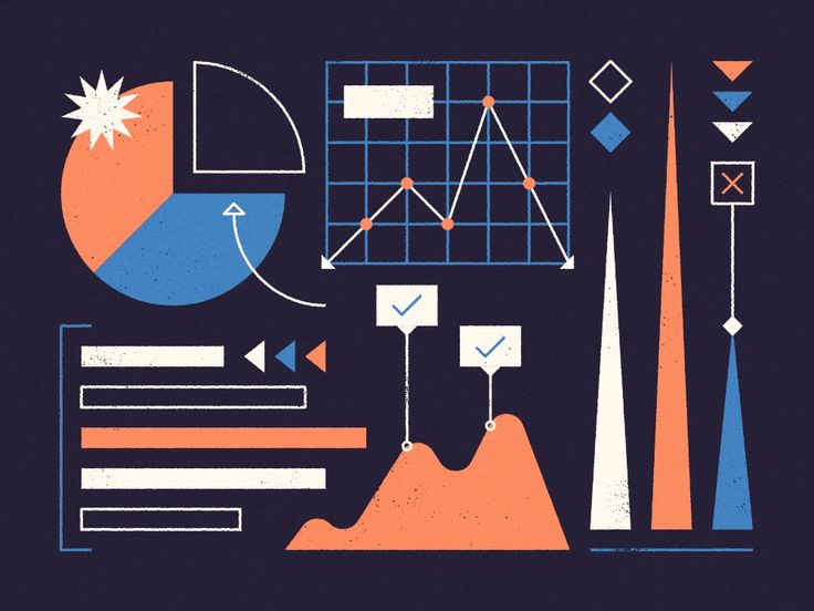
Common Visualization Types
There are numerous visualization techniques, each with its strengths and weaknesses. Line graphs are excellent for showcasing trends over time, while bar charts are perfect for comparing categorical data. Scatter plots reveal correlations, and histograms display the distribution of data. Knowing these options is important for creating effective visualizations. Consider using a combination of techniques to illustrate different aspects of your data and tell a more comprehensive story.
Design Principles for Effective Visualizations
Clarity and Simplicity
A well-designed visualization prioritizes clarity and simplicity. Cluttered visualizations are difficult to understand and can mislead the viewer. Use a limited color palette, and ensure that the labels, captions, and other elements are easy to read. Choose a visual style appropriate to the message you want to convey, and avoid gimmicks or distractions.
Visual Hierarchy and Emphasis
Effective visualizations utilize visual hierarchy to guide the viewer’s attention to key insights. Strategic use of size, color, and position can draw attention to critical data points and patterns. This clear visual hierarchy is important in directing the viewers’ eye to the important information, ensuring that the message is impactful.
Interactive Visualizations for Deeper Engagement
Empowering the Audience with Interaction
Interactive visualizations allow users to explore data in greater depth and control the presentation. Interactive dashboards, for example, enable users to drill down into specific data points, filter data by various criteria, and manipulate visualizations to uncover different perspectives. This capability allows for increased audience participation in the data analysis process, as they can explore the data from various angles.
Tools and Technologies
Several powerful tools facilitate the creation of interactive visualizations. Tableau, Power BI, and other data visualization software provide intuitive interfaces and advanced features for designing and sharing interactive dashboards. These tools allow for greater customization and enable users to modify the visualizations to suit their specific needs, thereby enhancing the engagement of the audience in the data analysis process.
Storytelling with Data Visualizations
Crafting Compelling Narratives
Data visualization is not just about displaying data; it’s about creating narratives. Tell a compelling story by weaving together data points, contextual information, and insights. Consider the overall message you want to convey; how can your visualization support this message?
Contextualizing Your Data
Adding context to data visualizations is critical for understanding the broader implications of the insights presented. For example, providing historical context, comparing to industry benchmarks, or highlighting significant events can provide a richer understanding of the data and its implications. This will allow the audience to draw informed conclusions and take appropriate action.
What are the key factors to consider when choosing the right visualization method?
Choosing the right visualization method depends on several factors. First, consider the type of data you have. Bar charts are ideal for comparing categorical data, while line graphs are better suited for illustrating trends over time. Second, consider your message. What story are you trying to tell? Third, consider your audience. What level of detail do they need? Interactive visualizations can provide an excellent way for users to interact with the data to uncover different perspectives. Finally, keep in mind the overall presentation’s design; the visual style should reinforce your message.
What are some practical tips for creating visually appealing and engaging data visualizations?
Visually appealing and engaging data visualizations often use color effectively. A limited color palette is better than a chaotic one. Make sure labels and captions are clear. Interactive elements can increase user engagement, and ensure the design reinforces your message. Employ a clear visual hierarchy to guide the viewer’s eyes to essential insights. Finally, consider adding annotations or supplementary text to clarify complex concepts.
What tools are available for creating professional data visualizations?
Several powerful tools are available for creating professional data visualizations. Tools like Tableau, Power BI, and others offer user-friendly interfaces for data import, cleaning, and visualization. These tools provide a wide array of chart types and interactive features for creating dashboards and reports. Other tools are available, such as Qlik Sense, Google Data Studio, or specialized open-source libraries that might be more suitable depending on the project’s requirements and budget.
How can I improve the communication of my data to different audiences?
Tailoring your data visualization to the intended audience is crucial for effective communication. Different audiences may require varying levels of detail and complexity. Consider your audience’s knowledge level of the subject, and use appropriate visuals, explanations, and supporting details to help them understand the data. If possible, present data using examples that illustrate the main ideas more effectively and provide easy to understand contexts.
Frequently Asked Questions
How can I create effective data visualizations for a business report?
To create effective data visualizations for a business report, you should prioritize clarity, simplicity, and accuracy. Use visualizations that match the data you are presenting; a scatter plot might be more suitable for demonstrating correlations, while a bar chart might be better for comparing categories. Begin by identifying the story you want to tell with the data, and choose appropriate visualizations to highlight your key insights and patterns in an easily digestible way. Use a concise and clear narrative. A combination of visuals and written text can help to effectively communicate complex ideas.
In conclusion, transforming data into compelling stories through effective data visualization techniques is crucial for conveying insights and driving action. By mastering various visualization methods, businesses and individuals can unlock the power hidden within data, making it accessible and understandable for all. The key takeaway is to choose the right visualization method for the specific data and message you want to convey. Remember to maintain clarity, accuracy, and an engaging design to ensure maximum impact. If you’re interested in learning more about specific tools or techniques, I encourage you to delve deeper into the provided resources. Visualizing your data effectively is an ongoing learning process, so keep experimenting, refining, and seeking out inspiration to continue mastering these essential skills.